7 Effective Ecommerce Call To Action Examples
Are you someone who owns a business who gets a lot of visitors, but rarely do people purchase anything?
You invested a lot of work into fine-tuning it and ensuring everything flows in the right direction. But why are your visitors putting nothing in their shopping carts? You have invested time and effort into advertising your store, and while it is receiving traffic, it needs to convert that traffic into sales.
Your customers may have difficulty exploring your store since there isn’t a prominent Ecommerce call-to-action button. They need to be more knowledgeable about which links to click on.
“Buy now” and “Add to cart” seem to be the most prominent CTAs on any eCommerce website.
In this blog, we’ll look at some illustrative ecommerce call to action examples of stores with unique calls to action and discuss how you may learn from them. You can learn from their methods and implement them in your retail establishment.
What exactly is meant by a “Call to Action”?
Your “ecommerce call to action buttons” is the section of your website that instructs visitors on what they should do, where they should click, and what they should purchase. It illuminates the way to your cash register and converts a visitor into a paying customer in the shortest amount of time feasible.
The “Buy Now” or “Shop Now” buttons that you have on your storefront are the most glaring examples of calls to action that you may have.
Because there is no unambiguous answer to whether button, phrase, layout, or size performs best, it is essential to test and refine your storefront continually.
Let’s delve deeper into what makes a compelling “ecommerce website call to action,” shall we?
Even though this is something that, depending on the nature of your business, can be tested, improved, and tweaked over the years, it is still beneficial to have a fundamental understanding of the strategies that should be applied to create a compelling call to action.
Tips To Create an Amazing eCommerce CTA”
The sense of urgency boosts conversion rates.
If consumers believe there is a short window of opportunity, they may be more likely to purchase.
It is frequently displayed in windows and aisles of retail stores. You’ll often see sales near the end of the season that lasts for a whole week. The same principle applies to your online store as well.
For example, if somewhere on your storefront you added a stock level or something that says “Buy now—only on sale until midnight,” you are building on the sense of urgency. Similarly, if something reads “On sale only until midnight,” you also take on the importance of speed.
The team at ConversionXL conducted a case study demonstrating how they could boost their conversion rate by 332% simply by incorporating a sense of urgency into their product. That’s a big boost for any company, big or small.
Test various colors
Even if no one hue is proven to convert better than any other, it is essential to ensure that you are utilizing a color that your visitors and your brand can identify with.
Here are a few things to keep in mind when deciding the color to utilize for your call to action (CTA).
- Make it obvious where to click by adding white space around your call to action.
- It should be clearly visible and readable
- Make sure that it is distinguishable from the surrounding environment.
- Be careful to stay moderate with the number of colors and motions.
- Make use of straightforward buttons and copy.
Make sure your effective call to action on an ecommerce site is displayed as a button rather than as simple text, even though most Shopify themes already contain this functionality. Even if it simply has a thin border around it, it is a significant improvement to have that instead of a text link.
A significant amount of evidence and research demonstrates that buttons are an effective method for guiding site visitors through the purchase process.
Make sure that the wording that is contained within the button is concise and to the point as well. A straightforward “purchase now,” “add to cart,” or “buy” button works well.
A helpful hint is that you can adapt the content on your buttons to fit your marketing market. If you are selling a product such as coffee, you might want to test modifying the copy on your buy button to say “Brew it” and see if it increases conversions.
Featuring heroic figures prominently on your storefront is essential.
Hero images can draw attention to a specific product or collection; put another way, they can serve as a resounding rallying cry to get people to take action.
According to a study by Notre Dame University, the first image in a set of five photographs receives 84% of all clicks when displayed in stores that use rotating slideshows.
Make sure your hero image links to a specific product or collection, so customers can more quickly complete their purchases.
Maintain its position “above the fold.”
Keep everything visible without having to scroll down. The point on any website reached after scrolling down is called the “fold” of the storefront. The material shown above the fold is the first thing customers see when they enter your shop.
If you can attract a visitor’s attention above the fold, they will continue to click through and explore the rest of your store.
Language & Copy for the CTA
The only unbreakable guideline for CTA copy is to ensure that it is succinct and to the point. In the example of a call-to-action that can be found below, Lems Shoes solely uses the phrase “Shop Now or Shop new styles” to direct users from the homepage to the various product pages.
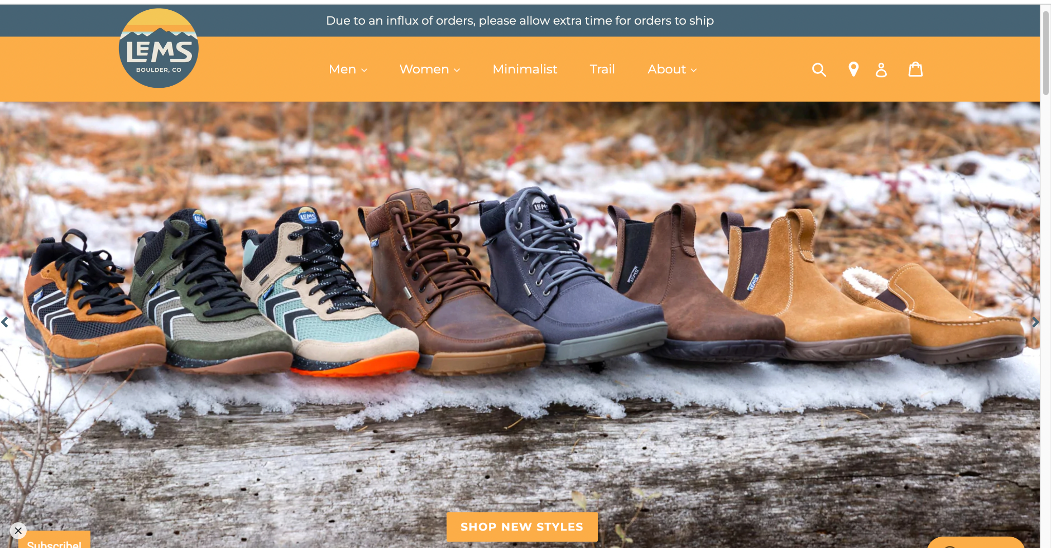
In this regard, psychology also plays a significant influence. As you browse the internet, you will notice that many calls to action (CTAs) include a timeframe component, such as “Show Now,” as opposed to simply “Shop” or “Shop Here.” This is because individuals react favorably to feelings of urgency and shortage. When people are given a specific time to complete an activity, they are more likely to see it through to completion.
Examples of the Best eCommerce CTAs
- 1. Sriracha 2 Go
- 2. Bixbi Pet
- 3. Department of Motivation
- 4. Carry on Cocktail Kit
- 5. Manpacks
- 6. Puravida
- 7. TOMS
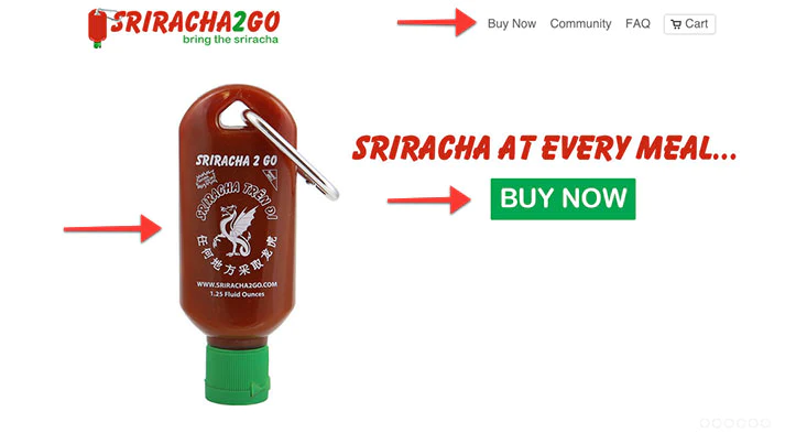
Why this CTA is effective:
When you visit the Sriracha 2 Go storefront, you will most likely feel compelled to purchase by clicking on one of the “buy now” buttons. You are entirely aware of the correct button to connect. There is no ambiguity in the method of acquiring their merchandise.
Above the fold, they provide information on the product’s appearance, its functions, and how it can be purchased.
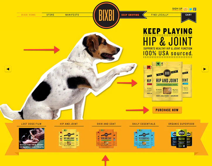
Why this CTA is effective:
They do this by using some very bright colors on their storefront and using a “buy now” button that is a contrasting hue to capture the visitor’s attention.
The company Bixbi employs yet another ingenious strategy: encasing its product collections behind a banner.
When visitors see different products on the front page arranged alphabetically by name, they are less likely to click on those products than if the entire call to action phrases for products collection were given its own area.
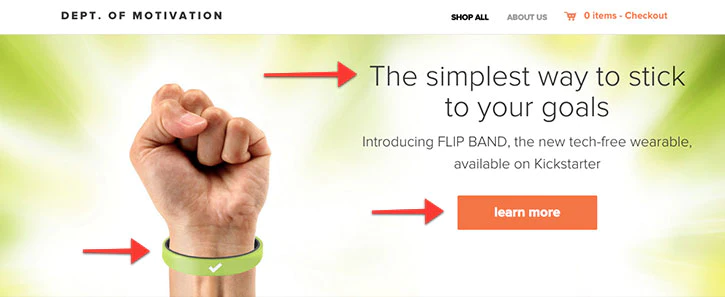
Why this CTA is effective:
The Department of Motivation makes the most of the opportunity presented by keeping the most crucial features of its store visible without having to scroll down.
The visitor is aware of what the product is, what it looks like, and precisely where to click, thanks to an impactful hero image.
Their storefront looks excellent above the fold on every device at any resolution, largely due to the utilization of a theme that is responsive.
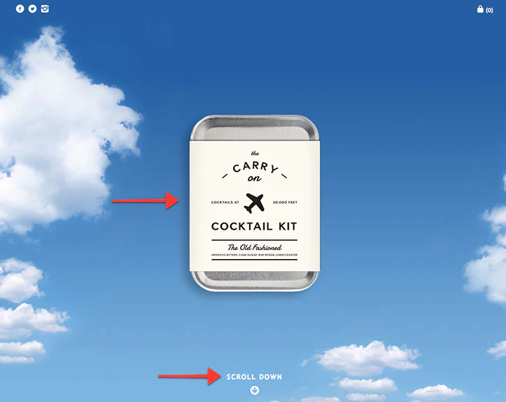
Why this CTA is effective:
The Carry on Cocktail kit is a stunning illustration of a powerful storefront with a straightforward but efficient call to action. It is one of the most customized Shopify stores on the list.
As soon as we walked into their storefront, we had a clear view of their merchandise. A straightforward statement that says “Scroll down” piques our interest, and as a result, we continue to scroll down the page to learn more about the product.
It is an excellent illustration of a call to action that directs the user to the checkout page. In addition to that, it gives their logo and product a unique and entertaining twist.
Why this CTA is effective:
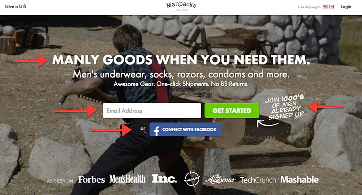
The storefront of Manpacks is an excellent illustration of all the hints we discussed in the last section. Their primary call to action is shown above the fold in the hero part of their website, and it is easy to understand.
They offer a crystal-clear explanation of what they are offering, a call to action that is quite obvious, and a choice to begin using Facebook.
Why this CTA is effective:
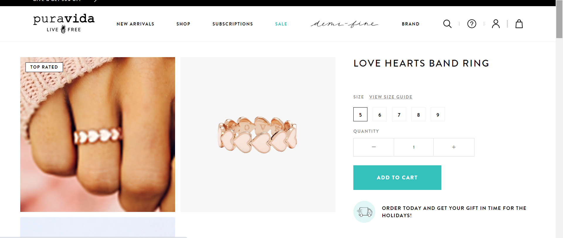
The puravida’s ‘Add to Cart’ section is an ideal example of how the CTA’s should be. The unique part of this CTA is that they have clearly put threeimages, one as a close up and the other of the product, which gives the end customer a proper glance of what they are purchasing.
Plus the sentence after delivery icon persuade the customer to buy the product as soon as possible “ORDER TODAY AND GET YOUR GIFT IN TIME FOR THE HOLIDAYS!”
The overall interface is very simple, muddled with sober colors and easy to attract, hence it does not confuse the customer even 1%.

Why this CTA is effective:
TOMS understand the significance of collaboration with other brands too and teamed up with Krostnewyork. The above image of TOMS is a clear resemblance of how TOMS knows how to entice the followers with its offers like limited edition collection.
Moreover, their giveaway is full of CTAs LIKE re-share this post for bonus entry, tag a friend in the comment section and follow to be part of this giveaway and winners will get TOMS x KROST collections.
Rather than simply focussing on the usual ‘Buy Now’ CTA aspect, TOMS focuses primarily on having social connections and very subtly focuses on the CTA.
Optimize and Test the CTA of Your eCommerce Store:
Following the presentation of several instances of calls to action, it is now your chance to put some of these strategies into practice when you are developing your eCommerce website. Some other important CTAs are Buy Now, Add to Cart, Proceed to checkout.
It would help if you experimented with a few different variants of colors, typography, and other elements in your store to see how well they function.
If you are an online merchant and want to create such amazing call to action on your website, we can assist you with this as Rock TechnoLabs is an end-to-end digital eCommerce agency supporting ecommerce businesses like you for the past 10 years to get higher conversions and scaling the enterprise with robust storefronts. We are just a call away – +91 79400 488843

