Benefits of Mobile-friendly eCommerce Website

On April 21, 2015, Google launched the “mobile-friendly update,” which is designed to boost the ranking of mobile-friendly pages on mobile search results. A year later, in 2016, Continuing to make the web more mobile-friendly, Google announced it would be strengthening the mobile-friendly ranking signal.
The mobile-friendly update launched by Google was only designed to impact mobile search results and there was no boost for mobile-friendly sites when a user searched on a desktop.
The term “mobile-friendly website” is very much common nowadays, but do you really know what that means? Why does it matter? Why should you care about your website being mobile-friendly? And what exactly makes it better? Let us explain what makes a mobile-friendly site and why it’s important…
It’s no secret that consumers are using their smartphones and tablets more often, and they expect websites to be optimized for these devices, too. This is why a mobile-friendly website is essential. It allows users to browse your site from anywhere without having to download or install anything. The key benefits include better user experience, increased conversion rates, and greater brand visibility.
- While talking about mobile-friendly website statistics, Did you know that about 61% of visitors won’t return to a website that is not mobile-friendly?
- Over 60% of website traffic comes from smartphones. – Statista
- Did you know that in 2021, more than half of the world’s population will access the internet from their smartphones? That’s 4,676.12 million people! Also, they are projected to reach 5,545.42 million users by 2025.
- It’s estimated that the average person spends 5 hours a day on their phone.
Why Does Your Business Need a Mobile-friendly Website?
Mobile devices now account for roughly 60% of Internet traffic (according to Google). That’s why having a mobile-friendly ecommerce website is absolutely essential to reach global audiences who access the web from their smartphones or tablets.
A mobile-friendly website has better SEO because it loads faster and shows up higher in search results. This helps your site earn organic traffic. In addition, mobile visitors convert at a much higher rate than desktop visitors. Having a mobile-friendly site also boosts conversion rates through improved user experience.
Some of the best mobile ecommerce sites include brands like Amazon, Flipkart, Myntra, Zomato, etc,
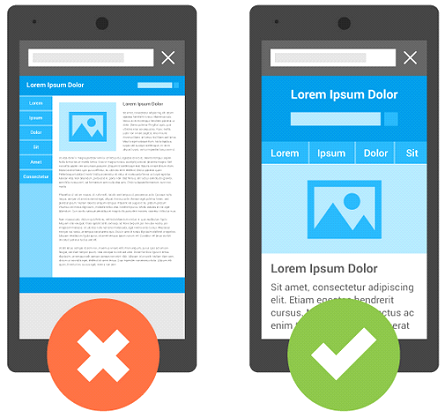
Having a responsive website is not enough; you also need to optimize the layout for mobile screens. A responsive design lets visitors view your entire website on smaller screens.
Your landing page should be the main focus of your mobile site, whereas a desktop version should display additional information such as special offers and other important info. If a visitor clicks through to your site from a social media post, a mobile-friendly site will allow them to access your content immediately.
What is the Advantage of a Mobile-friendly Website?
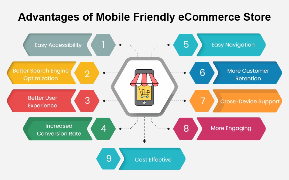
The internet is becoming increasingly popular amongst the younger generation. Many businesses have realized that having a mobile-friendly website is essential to attracting their customers and is considered one of the most important features of an eCommerce website. If a business does not have a mobile-friendly website, then it may miss out on potential clients who do use smartphones to access online information. Below we have listed some of the advantages of a mobile-friendly website.
1. Easy Accessibility
Imagine a customer who wants to purchase a product from your online shop, and he opens your website using his smartphone. The page is not properly opening and forces him to open that page on a desktop or laptop. He exits from your site. This is one of the common problems online shopper face.
A mobile ecommerce website is easier to access than those that do not take advantage of modern web design techniques. You no longer need to worry about loading issues, slow websites, and popups while browsing. If you are using a mobile device or tablet, you simply open the URL provided by your phone or tablet browser, tap the link, and surf freely.
2. Better Search Engine Optimization (SEO)
One of the best reasons to create a mobile-friendly website revolves around SEO. Search engine optimization (SEO) refers to how search engines interact with websites. These algorithms change frequently, making it difficult to predict how a page will rank in search results.
A mobile-friendly website is more likely to rank higher and appear at the top of search results on Google and other search engines. Because mobile users tend to type keywords rather than navigate links, a mobile-friendly site can generate more traffic and sales. Since mobile searches are already a big deal, having a mobile-friendly website increases the likelihood your company will appear in relevant searches.
3. Better User Experience
When you visit a mobile website, you get a clean and optimized experience. No unnecessary clutter, only the content you’re searching for—so no ads or unwanted popups. A mobile-friendly design increases user engagement and satisfaction.
Users won’t have to hunt around for the right button or menu item; they’ll simply tap or swipe their way around it. An effective mobile experience also makes it easier for people to share information and interact with others on social networks.
Mobile websites give users a much better user experience than desktop versions. Users often search online for products or services using their phones. When they find the product or service they were looking for, they want to buy it without having to navigate away from the mobile screen. Having a mobile version gives them a seamless transition between devices while browsing the website.
4. Increased Conversion Rate
One of the biggest issues facing any online seller is getting visitors to convert. Mobile sites tend to perform much better than traditional sites. People spend less time on mobile websites, meaning they are more likely to complete purchases.
In addition, smartphone users are much more likely to purchase items compared to those using laptops or desktops. A well-designed mobile site will increase conversions.
5. Easy Navigation
Mobile websites are becoming increasingly popular. As stated above, more than half of all web traffic comes from mobile devices now. You can use this trend to your advantage if you have a mobile-friendly website.
Most people’s first thought when browsing the internet is “I need to get off my computer!”. If they find themselves looking at their phone instead of their laptop or desktop, they’ll lose out on business. When someone visits your site via their phone, they expect to navigate easily.
Having a website that fits nicely on mobile screens while still maintaining good usability and functionality will help you reach more customers.
6. More Customer Retention
A mobile site reduces bounce rates and increases user engagement. Users who visit your ecommerce site via their phones stay longer and are much more likely to return. This means that even after they make a purchase, they may come back often.
This gives you the opportunity to build relationships with them and keep your customers coming back. Your customers will be happier and more loyal if they can shop from wherever it suits them best.
7. Cross-Device Support
If your site looks different on desktops than it does on smartphones, tablets, and laptops, then your customers might not feel comfortable using it.
People expect consistency across all devices, regardless of screen size or operating system. Having a mobile-friendly site means that your brand is ready to communicate effectively with everyone, everywhere.
8. More Engaging
Your visitors are more likely to engage with a mobile-friendly website than an ordinary one. Users prefer the option of interacting with their devices and apps rather than being forced to use mouse clicks.
9. Cost Effective
Finally, keeping your website responsive cuts down bandwidth costs. Not only do you save money by decreasing the amount of data transferred between your server and customers’ browsers, but you also avoid the cost of building duplicate versions of your site for each type of technology.
How to Make Your eCommerce Store Mobile Friendly?
1. Responsive Layout
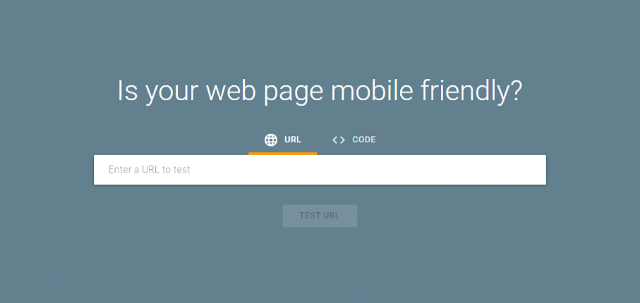
Responsive web design is simply designing your website to look good on any device, whether it’s a desktop computer, smartphone, or tablet. Your site should adjust its layout based on what kind of screen size the user has, whether that’s a large, high-resolution display, or a small mobile phone.
Most people use their phones to browse the internet, so how you design your website will determine how well they find you. The simplest way to know whether your website is friendly or not is to do a mobile-friendly test.
2. Dynamic Content
Dynamic content refers to pages that update automatically depending on the user’s actions, rather than having to refresh the page. You can create dynamic content using JavaScript, PHP, or other languages.
Dynamic content is perfect for providing information about the product you’re selling. Using a CMS, you can write a blog post, add images and text to explain details about your product, and then publish the post. This way, users don’t have to keep refreshing the page to get updated information; instead, the page updates automatically.
3. Mobile Optimized Content
Your website should work across screens of different sizes—both big and small. If someone accesses your site from a smartphone, they probably won’t be able to view everything perfectly. To ensure they get the best experience possible, you’ll need to optimize your website content for mobile devices. That includes designing your site to be responsive and optimizing images, videos, and other media.
4. Avoid Common Mistakes While designing a mobile-friendly website
Avoid using HTTP redirects on mobile devices, and Block JavaScript, CSS, and image files on mobile devices. Test all your mobile pages, texts & separate URLs, Prevent unplayable content on mobile devices, Provide a faulty redirect for mobile-friendly pages, Mobile-only 404s, Avoid interstitials, Mobile-friendly cross-link, Set the viewport correctly, make sure to have responsive web fonts, make sure all images are loaded in the cache, use Google Page Insights to identify issues that can slow down the website speed, avoid small fonts, and also make sure touch elements like buttons or links are not close to each other.
5. Resources and information required to build mobile-friendly pages
As Mobile devices fall into two categories:
-
- Smartphones: Mini desktop computers with small screens, and include Tablets, Android, and iPhone devices.
For smartphones, the Mobile-Friendly Test, Search Console mobile usability report helps to describe issues that can affect your mobile-friendly page. Chrome browser supports several smartphone layouts in the mobile emulator and device mode.
-
- Feature phones. Less capable devices, and are handled differently by Google than smartphones.
For feature phone site developers, the Resources and information required: SERP and any pages linked by SERP are transcoded and all images in SERP and any pages linked by SERP are resized unless a user specifically opts out.PageSpeed insights. Feature phone markup dialects, including XHTML Basic, WML, XHTML MP, and cHTML. Feature phone validators include Mobile-friendly XHTML Validator (W3C) and Mobile-readiness checker (.mobi). Feature phone emulators include an i-mode emulator (DoCoMo) and User-Agent Switcher (Firefox plug-in).
Final Thoughts
In conclusion, having a mobile-friendly web design is a great way for a business to increase its reach and capture more customers. If you do not have a mobile-friendly website, you could lose out on valuable traffic and conversions. A mobile responsive website will open a lot of opportunities for your online business.
In a mobile-first age, eCommerce businesses can’t ignore users who are using smartphones. For every business with an online presence, having a mobile-friendly eCommerce website is a must. Let us help you make your website mobile-friendly, so you can attract more customers, increase your sales and surpass your competitors on Google!


 +1 917 722 7715
 +44 2037 698881