Ecommerce Navigation Best Practices For Better Customer Experience
What happens if you visit a departmental store and many of the products are spread here and there, completely unorganized, and you can’t find what you came for? Obviously, you will prefer looking for any other store with well-organized and proper management. Even if the store has all the products you need but can’t find them, you leave the store.
Similarly, your ecommerce site navigation works; no customer wants to face difficulty; they all desire a great shopping experience. Navigation plays a very important role in customer conversion and sales if you want to utilize your online enterprise’s full possibilities. The website navigation must fulfil the criteria (trust, security, & appearance) to let them stay and move seamlessly.
According to Top Design Firm data, in 2021, 38% of people who land on the website for the first time look for the navigational links; if they see challenges, they surely disappear within seconds. Website navigation must be created in such a way that guides users to make purchases.
Navigation help in increasing the average time spent, thus allowing the customers to explore and discover the product. Ensuring that your site is accessed adequately via other device is also crucial because, as per Statista, in the last quarter of 2022, only smartphones accounted for 63% of online shopping orders globally, which makes it a necessity to ensure that your online store can be navigated from any device.
Now many ecommerce stores are generating tons of revenue; surely navigation would be an essential part of their store; the question is, what are those ecommerce site navigation practices that make a store stand out? In this guide, we will elaborate on how you can do the same and hook your website visitor with some outstanding ecommerce navigation examples.
But before that, let’s comprehend precisely what ecommerce website navigation is.
What Is Ecommerce Website Navigation?
Website navigation defines the structure and layout of an ecommerce website; these are the compilation of all necessary components on the site that assist visitors in flawlessly exploring the store and making the purchase. Navigation mostly consists of links that direct to various other pages of the store and are usually placed across the page header; these can be menus, buttons, & text.
Types Of Website Navigation
As navigation is the most influential segment of a website, it dramatically impacts how your website speaks to visitors and how they perceive different navigation. To know what types of navigation exist, their advancement, and how they display, let’s look at their variations.
Horizontal Navigation Bar
It is the most common type used by ecommerce merchants. It’s placed under the website header and lists the primary pages side-by-side. Furthermore, it helps users know where they can start discovering the product, and gives developers the flexibility to integrate full-width images on the page. Depending on the business and its need, these can go from 4 to 8 or even 10.

Dropdown Navigation Menu
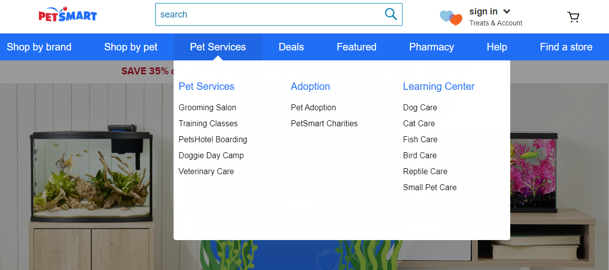
It makes all the information accessible from the main menus. If leveraged properly, it can be a yielding asset for your store. The menus are displayed when the user hovers their cursor on the main navigation bar, which displays multiple options to land on the desired page of the website. It provides ease due to its extreme simplicity, plus users are aware of such a menu that allows them to land on different locations on the website. As seen on the Pet Smart page, numerous services or sub-categories are stated in the dropdown navigation menu.
Hamburger Navigation Menu
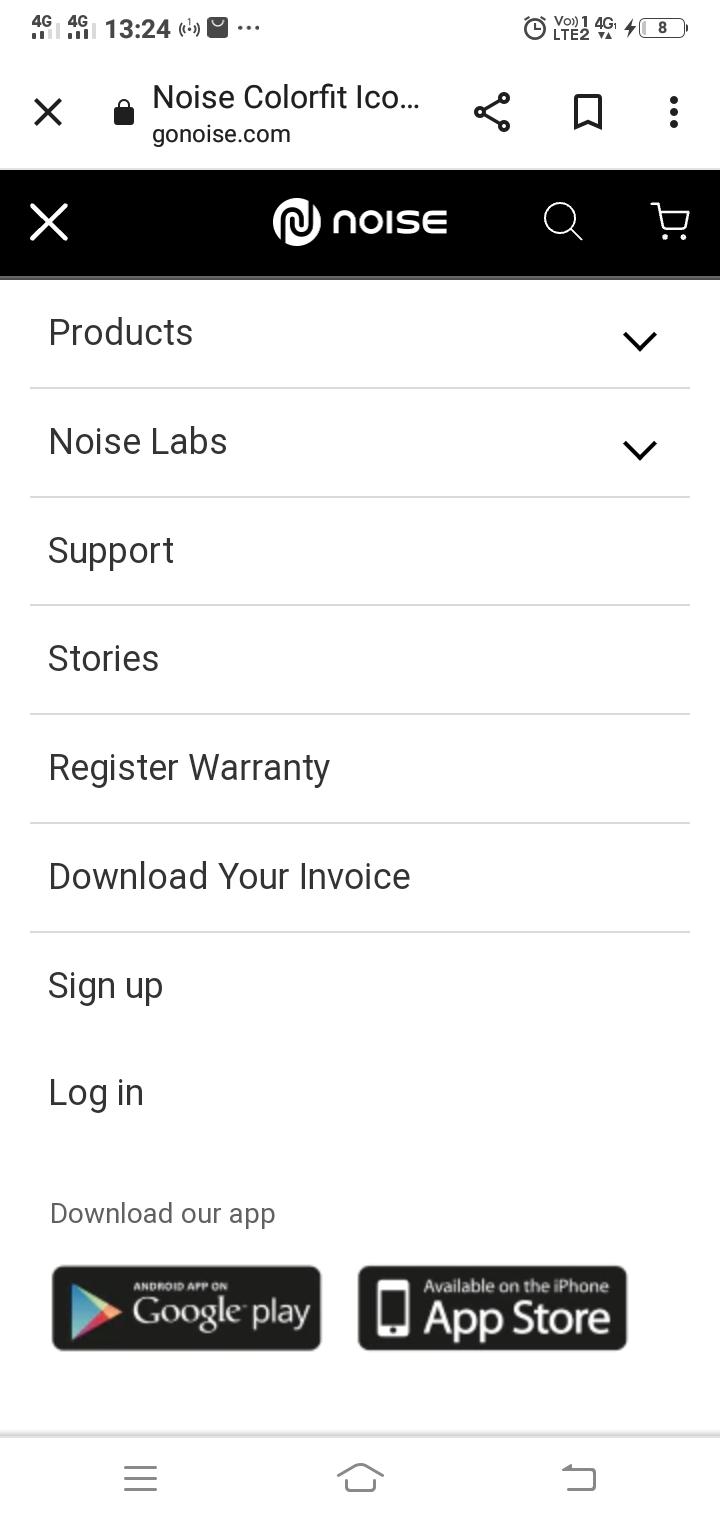
You can see such menus on mobile devices, which open a sidebar when clicked. As its name suggests, “hamburger” it shows in the form of a sandwich which designer Norm Cox created in 1981. It was an unpopular navigation pattern earlier but started gaining attention after the launch of more mobile phones in the market that seemed a better solution for pocketable screens. It has a well-organized visual for the human brain, so it is a universally used symbol for mobile sites.
Vertical Navigation Menu
Vertical navigation menus, also called vertical sidebars, stretch along the side of pages on a website or app to present complex content in simpler form due to mobile-friendly structure and offer great scope for responsive websites. Vertical navigation takes only the sides of a page instead of acquiring an ample space and eliminates messiness by introducing many links or items in one area that is quick to scan.
Ecommerce Navigation Best Practices With Proven Examples
Use Internal Search Plugin Or Tool
Here is an example, suppose a visitor land on your website, but he has already decided which product he/she wants to buy and doesn’t want to roam around thousands of pages just for one product. Their eyes are just looking for one perfect product; that’s it. Obviously, your buyer chooses to search for it instead of exploring the overall store.
One of the best ways to support such customers is to give them the option to simply search for the product name through the search bar option. It saves a lot of time and enables them to quickly proceed towards the checkout page.
Even according to Add Search data, the site search result in 1.8x more conversions and 15% of site searching used visitors accounts for 45% of all revenue for the online store, which indicates how the site search feature can assist in selling more. Moreover, 84% of companies don’t optimize their on-site search, which could be advantageous for your store’s profitability.
One thing you must remember while including a search bar is that it shouldn’t be surrounded by many other menus and other page elements, so it easily catches user attention and seems clear.
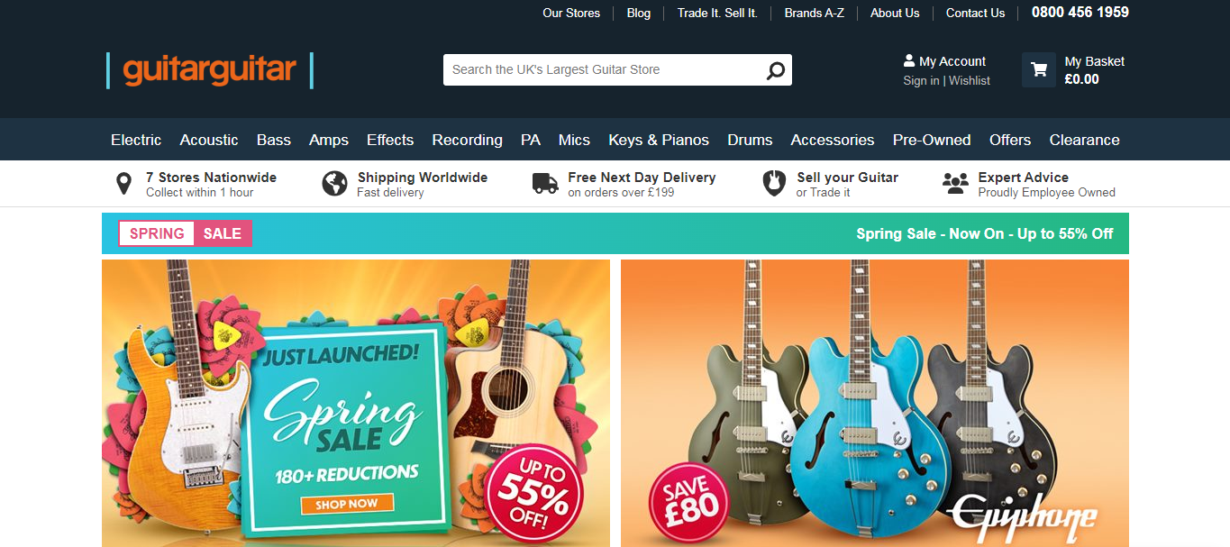
Guitarguitar is the perfect example; see how their search bar is just next to the logo, looking elegant, corresponding to the website color, where the user can quickly search the music instrument name and come down to the same page.
Link Contextual Image Straight To The Product Page
Visitors get frustrated when they click on the shown image, and it takes them nowhere; by displaying the image, your page communicates that this is the product, however how it works when user have expectations to see the same products, and they can’t check that out to move further with their purchasing decision.
Many ecommerce websites ignore this simple subject, which could increase the bounce rate. It would be better to choose the product image available for purchase and just link it to the main page. Even if you use any image just for inspiration, try to attach it to the relevant product page or category.
Product images are a big attention-grabbing element, and if users find that an image is not taking them anywhere, there are chances that they further ignore some linked pages to the image too. Don’t showcase an image which is not meant to be sold. If such pictures exist on your website, remove them and use a product or product category image available at the current time in your inventory.
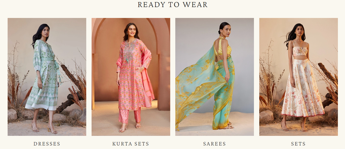
You can look at Anita Dongre, and how they have used these gorgeous woman images, which are clickable and direct the user when he clicks on any of the shown images. In addition, titles (dresses, kurta sets, sarees, & sets) are below-mentioned, which evidently reveal what the user should expect.
Convey Your Brand With Relevant Homepage Design
Within a few seconds of landing, the visitor must be clear about what your store is all about. With a scroll, they get an idea of what you do and offer. The first impression of the landing page (.i.e. usually the home page) defines whether users stick to it or just dump it.
First impression of the user on the website, 94% is just related to the design, even to a great extent, it matters a lot how your website is really looking to customers; as per the Blogging Wizard, 59% of online users like to browse beautiful and well-designed stores in comparison to dull and plain ones.
Also, even 39% of customers value the website’s color scheme more than anything else, which creates a good impression. As an online merchant, you should learn about colour theory as it integrates a multitude of concepts and design applications. In addition, having call-to-actions, meaningful images, and the same brand tone works hand-in-hand to win the trust and reliance of visitors.
Also, pay attention to the hierarchy; all the necessary elements must be organized and arranged in a proper format that seems natural and enjoyable, drawing users’ attention and persuading them to take action.
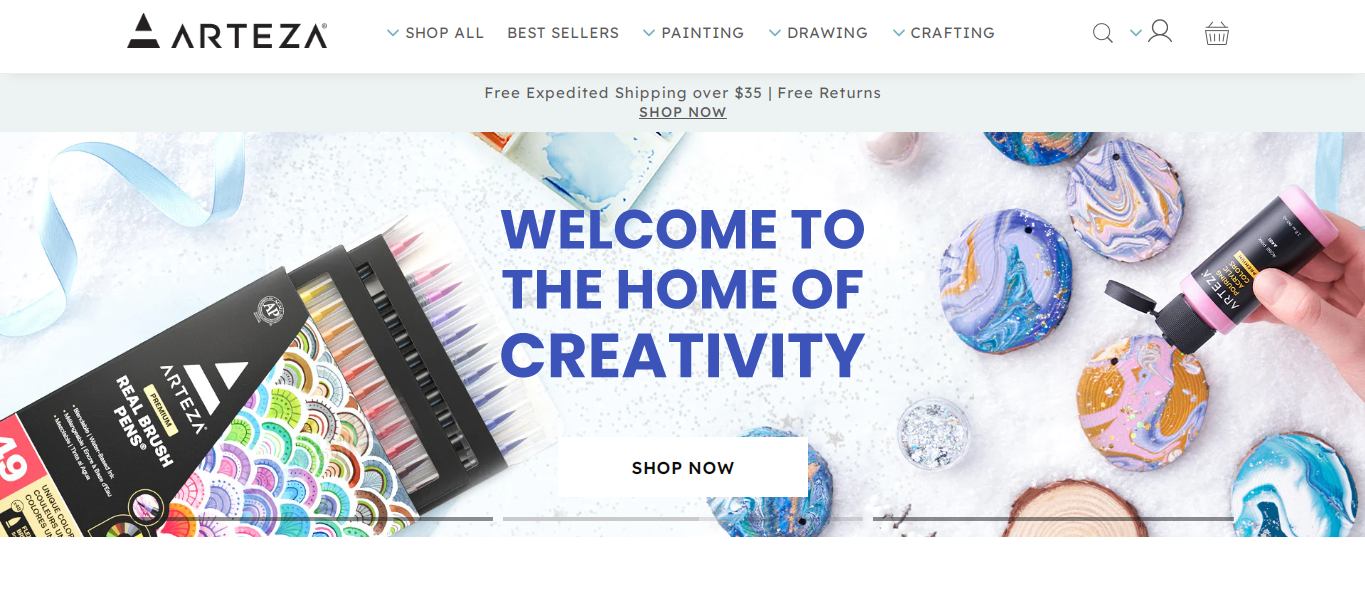
Another demonstration of site navigation best practices with exceptional web design is Arteza; just after landing on the page, you can see that they offer art supplies (canvas, acrylic paint, brushes, art sets, coloured pencil & pens, palette knives and more). As you scroll down, the website itself defines what the business revolves around.
Such website designs induce more interest in buying and leave no room for confusion.
Define A Clear Navigation Structure With Categories & Sub-categories
Categories tell people what range of products you are selling and which section of your category page to explore more. It assists users in finding what they are actually looking for in the store and where it exists. Moreover, each category name helps in bringing more traffic to the site and adds value to your SEO strategy.
It is found in large-scale usability testing that not displaying parent product categories in the main/primary navigation bar arises as a reason for users’ severe and multiple navigational problems. To make it clear, you have to understand the hierarchy of categories:
Parent/main category –
It is a broader topic of a particular niche or product having different child or sub-categories encompassing inside it. For instance, earrings.
Sub category –
This is specific to a particular topic or product that is displayed separately under the parent category, allowing the segregation of products more efficiently. For instance, Rajasthani jhumkas, studs, ear chains, hoops, & oxidized earrings.
Grouping sub-categories is vital, it takes a user only to the interested product pages and makes everything easier to understand on your store through these clear-cut ecommerce site navigation techniques.
Another significant point that comes under category is how many categories should be in your store, based on Baymard’s analysis; 21% of sites have insufficient parent categories; however, there is no defined number; either it shall be too deep or too shallow, both can be troublesome. Neither users want to overwhelm by seeing an extensive list of categories, nor do they like to spend more time in the store in the absence of necessary categories.
The solution is to find the balance, which varies from business to business.
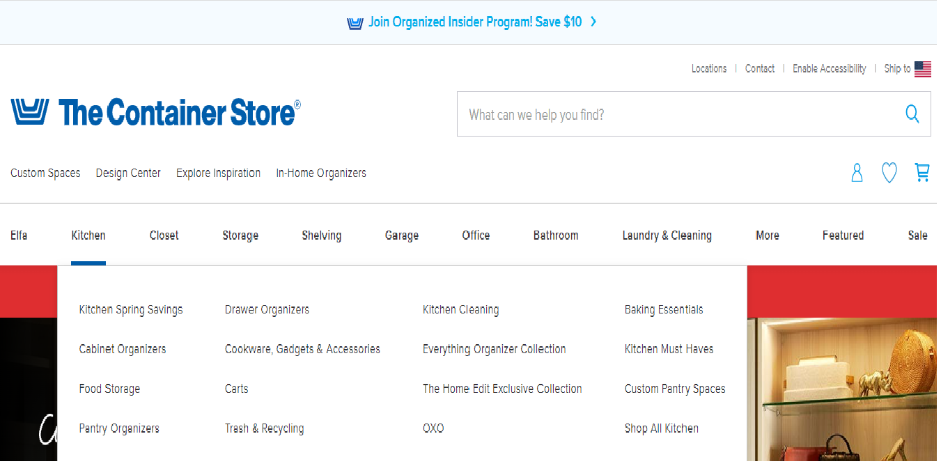
Let’s look at the example of The Container Store. They have total ten parent categories with their sub categories through which the buyer will instantly figure out which category to hover upon. When you keep your cursor on the kitchen, you are able to see all the options available for kitchen requirements.
Pages like these welcome a pleasant shopping experience for customers, which transition into scalability and growth of their business.
Display The Category “New Arrival” To Inspire Users
Many users prefer to see the new arrivals and don’t want to browse for previously existing products. It’s a good idea for ecommerce merchants to boost their sales for new arrival products. Simply adding this option as a filter works even better; users can quickly identify them. Shoppers can also display it with tags like “What new”, & “Trendy Arrivals”.
Additionally, it is helpful if you want to sell your seasonal products. More marketing tactics can be used, including vouchers, coupons, buy one, get one free, discounts, and so on, to persuade the user to buy as soon as possible before he/she loses it. This technique will enhance the chance of getting higher sales. Leveraging the new arrival category is also a beneficial way to target your old customers; chances are they will indeed check what’s latest they can pick up.
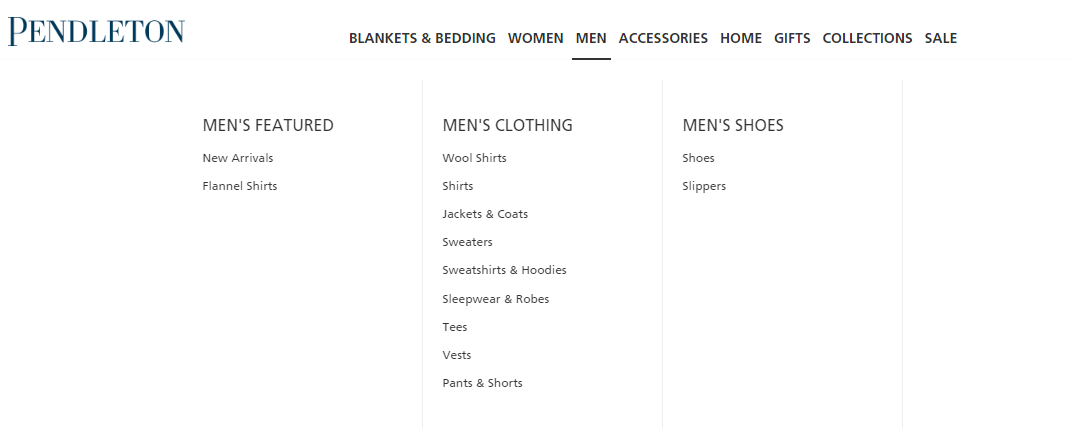
Pendleton is one of the ecommerce navigation examples in implementing the new arrival category inside all their parent categories. Whether you choose blankets & bedding, women, men, accessories, accessories, gifts, and others, they tempt visitors with new stuff.
You can also embed new arrivals on images. If any user scrolls down, it will inspire them to at least check the latest addition, collection or trend. However, you have to constantly review this category to ensure everything showcased has newly arrived.
Develop a User Friendly eCommerce Store By Following The Best Practices of Navigation
Most online businesses think that just inserting some nice-looking graphic exhibiting categories is enough; the website is ready to generate conversion. But it’s not how ecommerce stores work, that build a brand image through highly noticeable and feature-rich sites.
There are lot more to accomplish if an enterprise wants to bring visitors to the site and increase sales. You have to make efforts that add value to the user’s experience. The examples and ecommerce navigation practices listed above cover all the significant tactics one should implement in their store without underestimating any factor.
Rock Technolabs can help ecommerce enterprises to deliver a successful result; we are available 24×7 to support your store to 2x your sales with minimum cost. Get in touch!


 +1 917 722 7715
 +44 2037 698881