Do you know how long it takes website visitors to decide whether to stay on the website?
It takes around 3 to 12 seconds for them to judge your website and decide.
Regarding website design, the challenge is clear for B2B ecommerce businesses. You’ve probably experienced it:
- Slow loading speed
- Outdated designs
- Confusing navigation, etc.
All this can simply result in potential clients leaving your B2B website before even understanding your offerings.
A B2B buyer is looking for clear navigation, detailed product information, more questions that need to be answered, independent research, and a credible website, and structured to support the longer decision-making processes typical of business clients.
They must showcase industry expertise, cater to multiple stakeholders, and build trust—all while being user-friendly.
Here are some facts from different research and studies conducted:
- 88% of website visitors are less likely to return to a site after a bad experience. (Toptal)
- While 75% of users judge a company’s credibility based on its web design alone. (Stanford Web Credibility Research)
- A significant majority, 90%, of B2B purchasers research 2 to 7 different websites before making a buying decision. (Kurve)
- 94% of first impressions are related to the website’s design, and for a B2B company, the stakes are even higher. (WebFX)
Okay, these facts settle the importance of B2B web design but still don’t answer what all should be followed to optimize the B2B website. Let’s learn about B2B website best practices.
This detailed guide will explain how to design a B2B website that hooks your target audience.
We’ll cover:
- What is B2B Website Design?
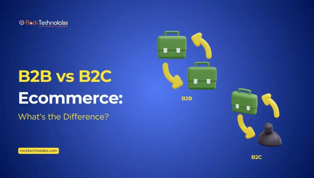
- Key Difference between B2B and B2C Website Design
- B2B Web Design Best Practices followed by some B2B website examples
Plus plenty more helpful tips. Let’s jump in!
What Is B2B Website Design?
B2B website design refers to the process of designing websites for businesses that sell products/services to other businesses.
It is an eCommerce model where transactions are held directly between businesses. B2B websites play important roles in these transactions.
B2B websites focus on:
- Conveying expertise
- Clear messaging and branding
- Detailed product specifications
- Easy-to-use navigation
- Building relationships
- Excellent storytelling
- Providing the information needed for decision makers across various industries
- Inviting CTAs (calls to action)
And all this is crafted on your B2B website with the target audience in mind.
Let us dive deep into the world of B2B website design.
Differences between B2C and B2B website design practices
B2C and B2B websites serve distinct audiences and, therefore, their design approaches differ significantly in several key areas:
| Key Areas | B2B | B2C |
| User Journey | Longer, complex journey involving multiple stakeholders; focuses on detailed resources like case studies, whitepapers, and product specifications. | Quick and straightforward journey aimed at immediate conversions with simple navigation and direct CTAs. |
| Buying Cycle | Long buying cycles require content that educates and nurtures leads, like blogs and newsletters, with clear paths for demos or consultations. | Buying cycle in B2C is typically short. Decisions are made quickly, supported by streamlined checkouts, reviews, and offers for immediate action. |
| Design Complexity | Balances aesthetics and functionality; professional design aligns with branding, using headers, icons, and infographics for clarity. | Simple, bold, and interactive visuals that create engaging and intuitive experiences for quick conversions. |
| Communication Styles | Formal and informative tone; emphasizes authority and expertise with detailed data and case studies. | Casual and direct; uses storytelling and emotional appeals to connect quickly with consumers. |
| Personalization | Personalizes based on user roles or industries; adjusts CTAs and information to address diverse client needs. | Recommends products based on user behaviour, enhancing experience and sales through personalized offers. |
| SEO Focus | Focuses on niche, long-tail keywords relevant to industries and solutions for precise targeting. | Optimizes for broad, high-volume keywords that align with popular and trending products to drive fast traffic. |
| Lead Generation and Conversion Strategies | Sophisticated approach with multiple touchpoints; uses gated content (e.g., case studies) and CRM integrations for lead nurturing. | Simple and direct strategies; one-click purchases, discount sign-ups, and streamlined checkout to minimize friction. |
| Interactive and Self-Service Tools | Interactive elements like ROI calculators, product configurators, and live chat for technical queries. | Interactive elements include virtual try-ons, product customization tools, and live chat for instant support. |
8 B2B Web Design Best Practices for Ecommerce
Here are 8 B2B Website Design Best Practices that can significantly improve your site’s performance and conversion rates:
1. Hook Your Audience with a Clear Value Proposition
A clear value proposition is crucial for capturing visitors’ attention and communicating your unique selling points.
Your value proposition should:
- Clearly define your target audience and their pain points
- Concisely articulate your solution and benefits
- Differentiate your brand from competitors
- Be prominently displayed on your homepage.
This will immediately engage visitors and encourage them to explore your website further.
2. Simplify Navigation: The Path to Conversion
Intuitive navigation is vital for guiding users through their journey. A well-structured navigation menu helps visitors find information quickly.
For B2B sites, clear categories, such as “Products,” “Industries Served,” “Resources,” and “About Us,” guide users through the site efficiently.
Information should be organized in a way that prioritizes key messages and supports user flow.
To break down complex or large information, you can use headers, sub-headers, visual aids, and bullet points like icons or infographics and make it more readable.
To simplify navigation:
- Streamline your menu to reduce cognitive load
- Categorize content logically for easy discovery
- Using clear and descriptive labels
- Provide a search function for quick access
- Ensure responsive design for mobile devices
It will be very easy for buyers to search for the products or services they are looking for and also reduce the bounce rates.
3. CTAs that Drive Action
B2B websites must have well-known and strong CTAs like “Download a Case Study,” “Request a Quote,” “Call For Price”, or “Schedule a Demo.”
These calls to action need to be strategically placed to capture leads at different stages of the buying process. Such effective calls to action ignite curiosity and encourage engagement.
To create compelling CTAs:
- Use action-oriented language
- Create visual contrast to draw attention
- Place CTAs above the fold and on key pages
- Use urgency tactics
- Test different CTA variations
It will not only drive visitors to take action but also increase sales and conversions.
4. Mobile Friendly
Nowadays, even B2B buyers and the multiple stakeholders who make decisions to purchase from other businesses use mobile phones, hence websites must be mobile responsive.
Ensure your B2B website looks and functions well on all devices, including mobiles, tablets, and desktops. A responsive design is very basic and must have because more than half of all web traffic now comes from mobile devices.
Ensure your website’s:
- Responsive design adapts to various screen sizes
- Content is easily accessible and readable
- Page load times are optimized
- Key b2b features and CTAs are prominently displayed
- Mobile-specific design elements enhance user experience.
This will provide a seamless user experience across devices, increasing mobile conversions.
5. Visual Storytelling: Paint a Picture of Success
Compelling visuals and storytelling attract audiences and convey your value proposition. Consider:
- High-quality images and videos showcasing products/services
- Customer testimonials and success stories
- Infographics highlighting key benefits
- Interactive elements (e.g., animations, scrolling effects)
- Consistent branding across visual elements
This will build trust and credibility, establishing your brand as a thought leader.
6. Put Your Customer First: Personalized Experiences
Personalized experiences foster loyalty and satisfaction. Design with empathy, and understanding:
- User personas and their pain points
- Tailored content recommendations
- User-centric language and tone
- Simple, intuitive interfaces
- Adaptive design for varying user behaviors
This will demonstrate a deep understanding of your target audience, increasing engagement and conversions.
7. Establish Trust with Security and Credibility
Displaying security badges, certifications, and industry recognition builds confidence and establishes credibility and trust.
Consider:
- Prominently displaying trust indicators
- Highlighting industry certifications and awards
- Showcasing customer logos and testimonials
- Providing clear contact information
- Ensuring HTTPS encryption
8. Data-Driven Design
Analytics inform design decisions and optimize performance. Consider:
- Tracking KPIs (key performance indicators)
- Conducting user testing and feedback sessions
- A/B testing design variations
- Analyzing user behavior and journey mapping
- Iterating design based on data insights
This will ensure continuous improvement, increasing conversions and sales.
4 Top B2B Website Examples
To illustrate the above design practices, let’s explore some B2B websites that stand out in the market and also effectively implement these strategies:
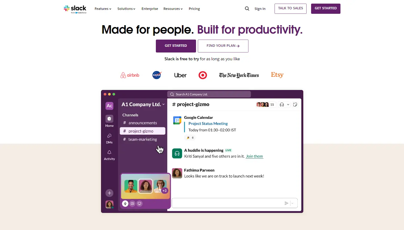
Slack
One of the excellent models for B2B website design and is known for its efficiency, clean, and minimalist design. Slack’s design focuses on straightforward navigation, visual storytelling, perfectly placed CTAs, and interactive demos and customer success stories.
No doubt that Slack’s design is perfectly aligned with its mission to streamline workplace communication and engaging content to appeal to business professionals.
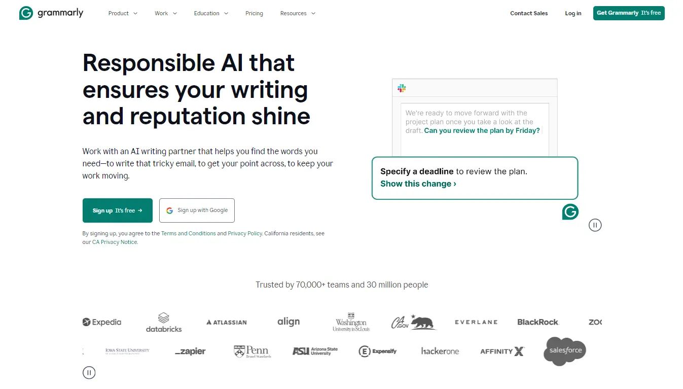
Grammarly
Grammarly shines as a B2B website design star because of its simplicity, clarity, and sophistication. It effectively demonstrates its value proposition through a straightforward interface and simple animations.
The design emphasizes conversion with CTAs, effortless navigation, responsive design, customer testimonials, and consistent branding, making it a masterclass in effective B2B design.
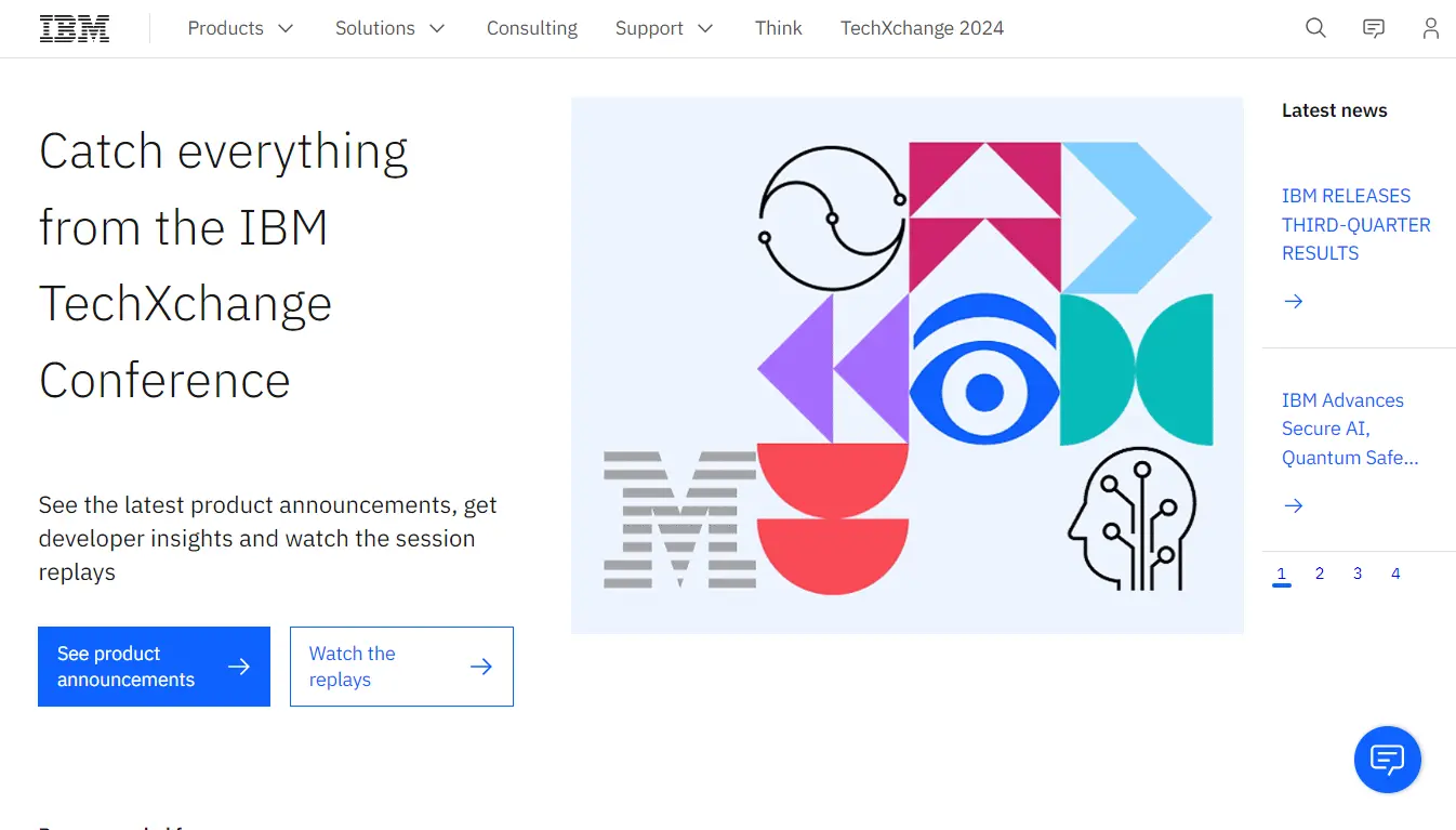
IBM
IBM’s – one of the best B2B eCommerce portals and also a B2B design masterpiece. Not only does it balance innovation, but also features intuitive navigation, engaging storytelling, and thought leadership content.
IBM’s site sets a high standard and makes it a shining example of effective B2B design with scalable design, prominent CTAs, expert insights, accessibility, seamless user experience, and unified visuals.
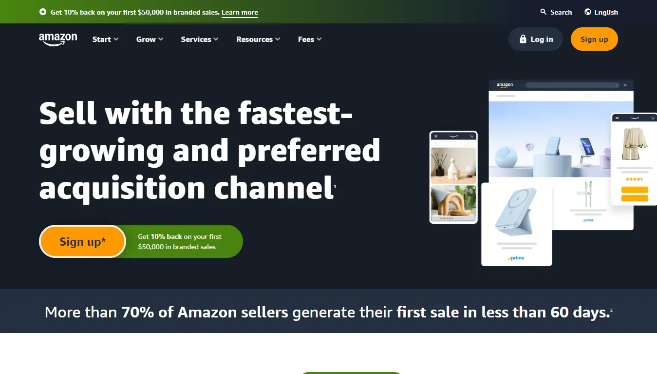
Amazon
This list would be incomplete without this eCommerce giant. This B2B website combines simplicity with innovative functionality and features.
What stood out to us about this B2B portal is its clear call to action and the offer placement of “Get 10% back on your first $50,000 in branded sales” along with the “Sign Up” button. With a professional design and an easy-to-navigate layout, Amazon ensures that visitors find relevant information quickly.
These examples show how leading companies are leveraging web design to build trust, streamline the user journey, and ultimately drive conversions.
Rock Technolabs – Your Perfect B2B Ecommerce Solution Partner!
Building a well-designed and successful B2B website is no longer a luxury, but a lifeline to meet the specific needs of your B2B customers, connecting with them, driving growth, and staying ahead of the competition.
By leveraging these expert strategies and best practices outlined in this blog, you’ll be equipped to:
- Captivate Your Audience
- Simplify Complex Sales
- Fuel Business Growth
Take the first step towards transformative growth. And don’t forget, your B2B website is the most important component and the digital face of your brand. Investing time and resources into optimizing it will pay off in building credibility and enhancing customer loyalty.
If you need more help than the best practices provided above, reach out to our experts at Rock Technolabs. We’ve helped many B2B companies turn their websites into lead and sales-generating machines, and would love to do the same for you.
Whether you’re looking for Magento B2B development services or want to hire dedicated Magento developers — Simply contact us and tell us about your B2B project!


